MasterClass | Editorial Workbook
MasterClass sets one of the highest visual bars in digital education. When their team needed illustration work that could open chapters with intention and atmosphere, the brief was as much about feeling as it was about form.
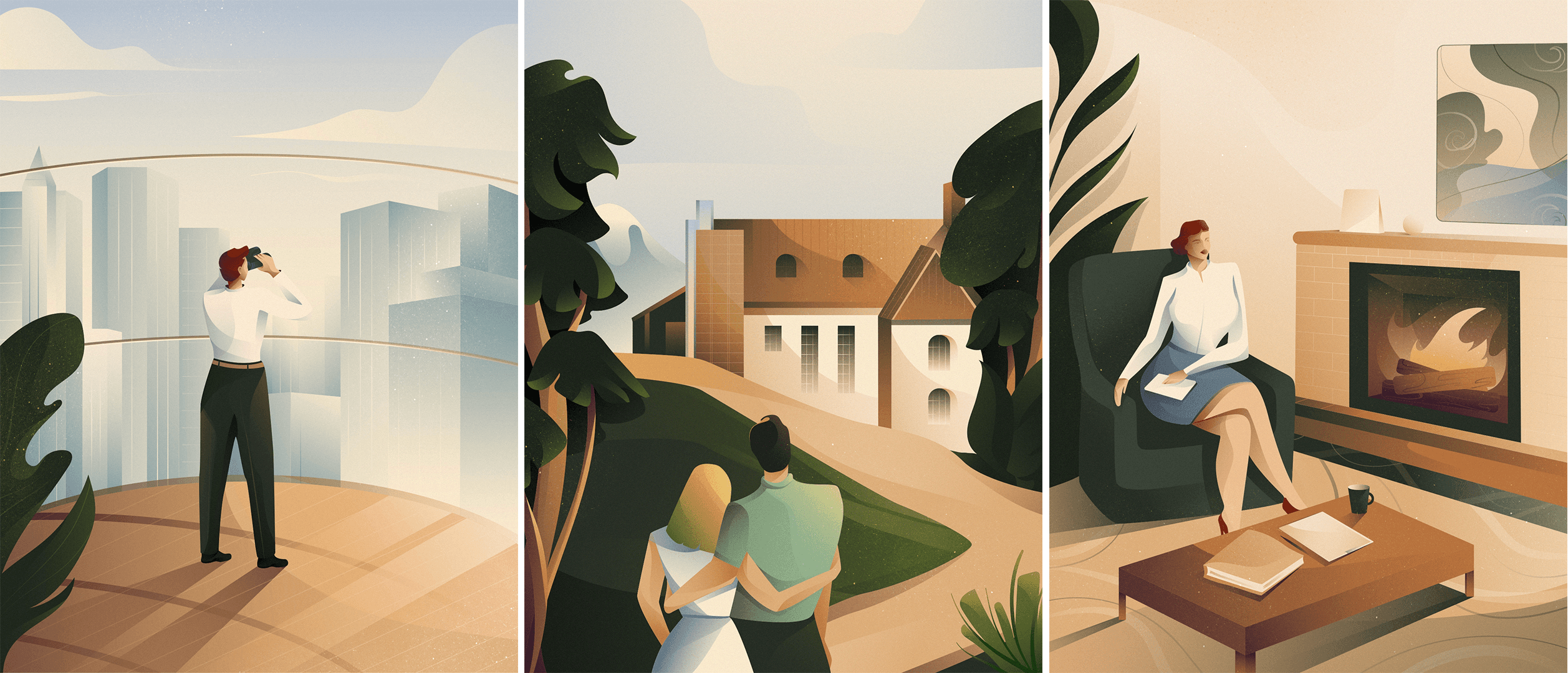
Three vector illustrations. Three chapter openers. One cohesive visual language built to match the sophistication of the course itself.
Working closely with the MasterClass Creative Director was one of the highlights of this project. The collaboration struck the right balance — clear creative direction paired with the freedom to bring my own visual voice to each illustration. It offered a great insight into how one of the world's most design-forward teams works. I felt extremely lucky to have worked with them.
Client
MasterClass | Editorial Workbook
Scope of Work

The Brief
Create three vector illustrations for the chapter openers of MasterClass's Architecture course — compositions that feel open, breathable and visually aligned with the course's creative and intellectual tone.
My Role
Editorial illlustrations. Responsible for concepting and executing three editorial vector illustrations — developing the composition, palette and visual language from brief to final delivery in close collaboration with the MasterClass creative team.

Challenge
Architecture as a subject carries weight — precision, space, intention. The illustrations needed to honour that without feeling cold or technical. The challenge was finding the balance between visual openness and conceptual depth — compositions that felt considered without feeling overcrowded.

Process
Each illustration began with a deep understanding of the chapter's core idea — what does this moment in the course need to feel like? From there, compositions were developed with a clear hierarchy, ensuring the visual language translated the essence of architectural thinking — space, light, intention — into illustration form.
The Approach
Keeping compositions open and breathable was the guiding principle throughout. Every element earned its place — nothing decorative for its own sake. An airy, contemporary palette was chosen to enhance the intentions behind each artwork, supporting the narrative of each chapter without overpowering it.

Collaboration
Keeping compositions open and breathable was the guiding principle throughout. Every element earned its place — nothing decorative for its own sake. An airy, contemporary palette was chosen to enhance the intentions behind each artwork, supporting the narrative of each chapter without overpowering it.
Deliverables
Three final vector illustrations for chapter openers for architecture book.